Packaging 4 min read
A Tube That Tells a Story
Designing our packaging: how a paper tube of six edible cups became four panels — a name, a belief, a ritual and the facts — in English and French.
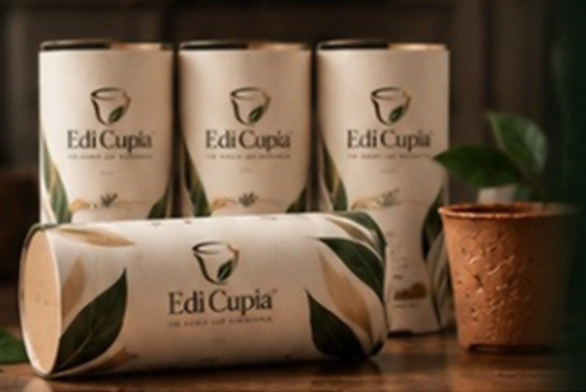
Packaging is usually the first part of a product anyone touches and the last part anyone thinks about. We wanted ours to behave the way our cup does: to hold something well, and then to give a little more than expected.
The result is a simple paper tube that holds six edible cups — 6 cups | 6 tasses — and tells the whole Edi Cupia idea as you turn it in your hand.
Why a tube
A cylinder echoes the shape of what it carries. The cups travel inside it, and the pack takes on their rounded silhouette rather than hiding it in a box.
A tube also asks to be handled. You do not read it all at once; you rotate it, one panel at a time, like a short story told in chapters. We designed those chapters deliberately. There are four of them, and each has a single job.
Panel one: the name
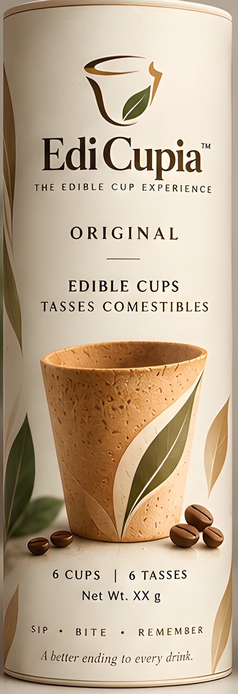
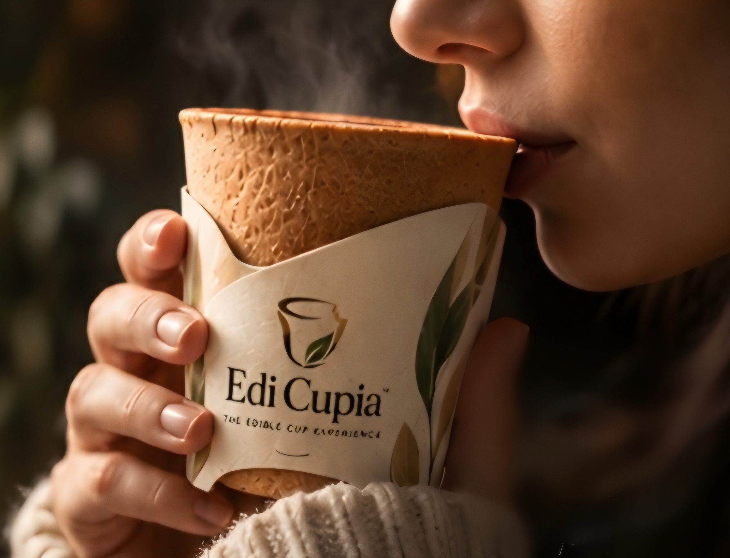
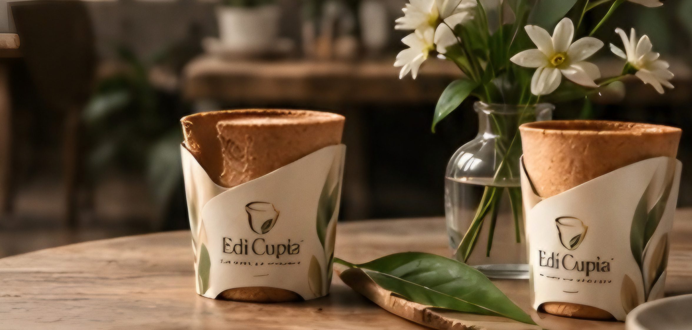
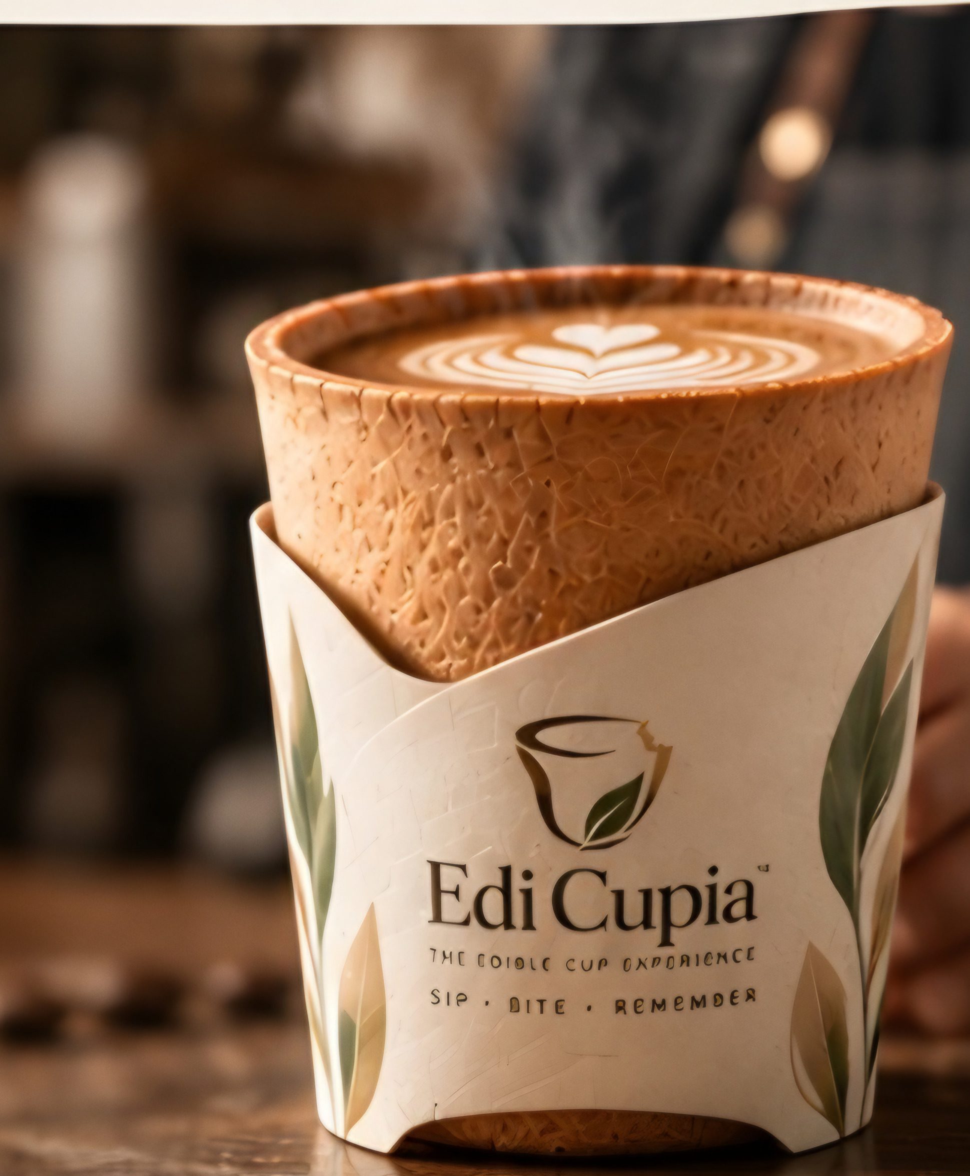
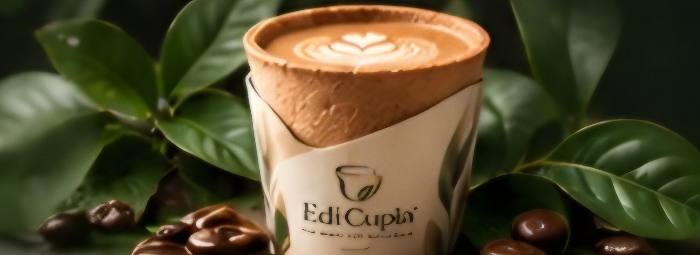
The front is intentionally quiet. The Edi Cupia mark — a cup with a bite taken from its rim, and a single leaf — sits above the wordmark and the line The Edible Cup Experience. Below it, one word announces the edition: ORIGINAL.
Then comes the description in both languages, EDIBLE CUPS and TASSES COMESTIBLES, set with equal weight, and an illustration of the cup itself among leaves and coffee beans. At the foot of the panel: 6 cups | 6 tasses, the ritual Sip · Bite · Remember, and one sentence in italics that sums up everything else — A better ending to every drink.
Panel two: the belief
Turn the tube and the brand story begins with the line we return to most often: More Than a Cup. A Kinder Tomorrow. Beneath it sits our philosophy, in a few unhurried sentences:
At Edi Cupia, we believe great moments deserve a better ending. Our edible cups are crafted to turn everyday drinks into a more meaningful experience — delicious, innovative and kinder to the planet.
Three small line icons follow, each carrying one promise: great taste, natural ingredients, a more meaningful tomorrow. We kept them short on purpose. A promise that needs a paragraph is usually hedging.
We wanted the pack to explain the idea before anyone opened it.
Panel three: the ritual
The next panel teaches the experience in three steps, each with a small illustration beside it. Sip. Enjoy your favourite drink. Bite. Enjoy the edible cup. Remember. A better ending to every drink.
It closes with a line set in spaced capitals: Same great drink. A more meaningful tomorrow. The order matters. The drink comes first, the cup second, and the meaning last, quietly, as a result rather than a slogan.
Panel four: the facts
The back of the pack is where clarity matters more than charm. It carries the practical product information in English and French side by side, storage guidance — Store in a cool, dry place. / Conserver dans un endroit frais et sec. — and a note that the best-before date is printed on the bottom of the tube.
There is a QR code labelled Discover Our Story / Découvrez notre histoire, which leads to a page written for the moment you scan it, and the website address. And there is a line we print with pride: Product of Bangladesh / Produit du Bangladesh, because that is where our cups are crafted with care.
The lid finishes the sentence
Even the top of the tube has a job. A ring of words — Sip · Bite · Remember — circles the mark, with A better ending to every drink curving beneath it. Whichever way the pack is standing, the idea is there to meet you.
Two languages, one voice
The concept and the brand were developed in Canada, and the pack is bilingual by design rather than by afterthought. That changes the design more than you might think. Tasses comestibles had to feel as natural as edible cups; neither language could be the small print for the other.
Restraint as a material
The palette is warm ivory, deep forest green and a touch of gold, with leaves entering from the edges of each panel. The design calls for a warm, tactile finish and restrained gold detail — enough to feel considered in the hand, never enough to shout from across a room.
If those colours look familiar, it is because this website borrows them from the tube.
A good package, like a good ending, is remembered for how it made you feel. We hope ours makes you curious enough to open it, and generous enough to finish what is inside.